The Sri Lankan government header: patterns no design system has
Put 512 government website headers side by side and a Sri Lankan site is easy to spot: a gold emblem, a name in three scripts, a ministry line underneath. None of the nine government design systems I compared has a component for that. Here is what the patterns are, why they are there, and which ones a Sri Lankan design system should keep.
In short
- Of 512 Sri Lankan government website headers, 54% show the national emblem, 37% write the institution's name in Sinhala, Tamil and English, and 38% label languages in their own script (සිංහල, தமிழ்).
- Ministries carry the emblem almost always (97%); universities almost never (8%).
- None of nine government design systems (GOV.UK, USWDS, Canada, AgDS, NSW, TEDI, Singapore, NL Design System, KERN) has a component for a name in three languages, a parent-ministry line, text-size buttons, a header hotline or a leadership block.
- The patterns answer real needs: state authority, three languages, who is responsible, and phone-first contact. Many are built badly: 101 of 187 trilingual names could not be found as text and appear to be pictures.
- Sri Lanka has no shared 'official website' line like the US, Singapore, NSW and Germany. A Sri Lankan design system should standardise the identity block, not delete it.
Easy to spot
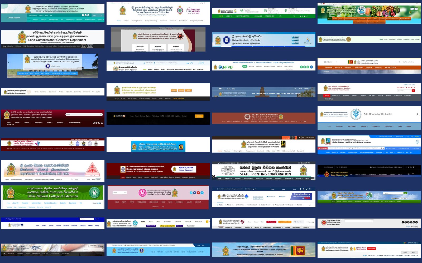
While building Overlook, I had the header of every Sri Lankan government website in one grid. Even zoomed out, you can tell they are Sri Lankan: a gold crest on the left, a name written three times, a ministry line underneath, a row of language names in their own scripts.
Next to them on the wall I keep nine government design systems: GOV.UK, the US Web Design System (USWDS), Canada, Australia (AgDS), New South Wales, Estonia (TEDI), Singapore, the Netherlands (NL Design System) and Germany (KERN). I went looking for their version of that header and found almost nothing. So I counted what our headers actually carry, and asked why.
Why bother understanding them
It is tempting to treat these headers as clutter and copy GOV.UK. I think that would be a mistake, for four reasons.
- They answer real needs. "This is the state", "this is in my language", "who is responsible" and "who do I call" are real questions. The emblem, the trilingual name, the ministry line and the hotline are answers to them.
- If a design system leaves them out, every site adds them back its own way. That is already happening. A design system that offers no place for the emblem will get 512 home-made versions of it.
- Some of them cost a lot. On a phone, a header with a trilingual name is 171px tall at the median, about a fifth of the first screen. Headers with neither an emblem nor a trilingual name are 120px.
- Need is not the same as habit. Some patterns serve citizens. Others are leftovers from 2005. You can only tell which is which once you have looked at them closely.
The anatomy of the header
Here is the typical Sri Lankan government header, drawn as a diagram. Few sites have all eight parts, but most have three or four.
- 1National emblem · 54%
- 2Name in three languages · 37%
- 3Parent ministry line · 13%
- 4A second mark (own seal or logo) · 27%
- 5Gov.lk badge · 10%
- 6Language names in own script · 38%
- 7Text-size buttons · 8%
- 8Hotline number · 6%
What a Sri Lankan government header carries
Share of 512 desktop headers with each element, read visually from screenshots taken on 29 September 2026. Flag and clock (lighter bars) come almost entirely from one embassy template.
1. The national emblem
The gold lion crest is the state's own mark. It is on letterheads, the Gazette, official seals and every government office name board. The website header is the letterhead moved online, so the emblem came along. It tells a citizen that this is the government and not a private company with a similar name.
How much it is used depends on how close the institution is to central government. Ministries use it almost always. Universities, banks and companies mostly use their own seal instead.
Ministries carry the emblem; universities carry their own seal
Share of headers with the national emblem and with a name in all three languages, by institution type (types with 15 or more usable headers).
The closest equivalents in other systems are GOV.UK's crown and Australia's coat of arms. The difference is that theirs come as fixed artwork with set sizes, spacing and colours. Ours are copied from wherever the designer found them, at every size, and sometimes squashed or pixelated.
Sri Lanka, as found

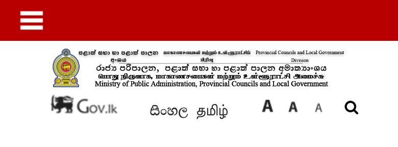
Ministry of Environment: emblem, English name, Gov.lk badge and text-size buttons.

President's Office: a small emblem with the name in three languages.
Design systems

GOV.UK: the crown and wordmark, one size and one colour on every service.

AgDS: coat of arms, "Australian Government" and the department name as one lockup.
2. The name in three languages
Sinhala and Tamil are official languages under the Constitution, and English is the link language. Government letterheads and name boards are normally written in all three, so the header is too. It is the most Sri Lankan pattern in the estate: 187 of 512 headers have it, and almost every embassy does (87%).




The idea is right. The way it is built usually is not. I could find the trilingual name as real text in the page code on only 76 of the 187 sites. Most of the rest appear to be one picture of all three lines. A picture of text cannot be read aloud by a screen reader, cannot be found by search, blurs when zoomed, and cannot be marked as Sinhala or Tamil.
Most trilingual names are pictures, not text
Of 187 headers that show the name in Sinhala, Tamil and English, how many have that name as text in the home page's code.
On a phone the stack gets worse. Three long names will not fit in 390 pixels, so they wrap, shrink or are cut off.
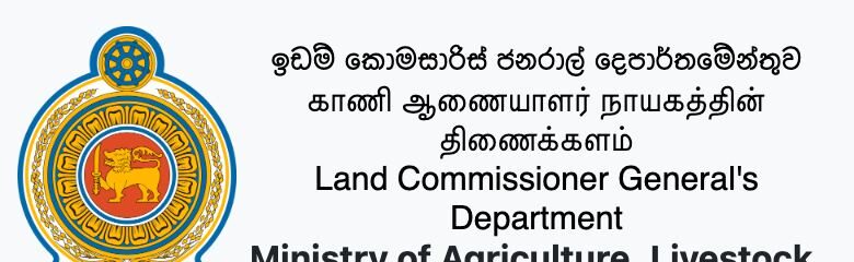
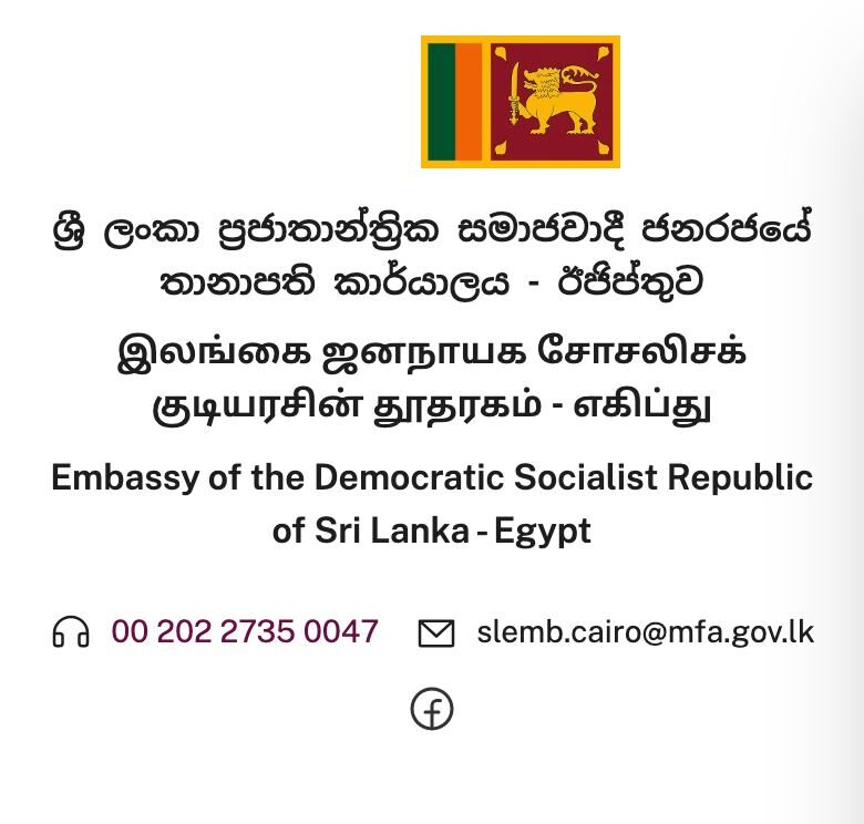
Only one design system has a name in more than one language: Canada's signature, "Government of Canada / Gouvernement du Canada", which comes as a fixed artwork file in a fixed order. Nobody has a three-language version, and nobody has one for scripts as different as Sinhala and Tamil.
Sri Lanka

Embassy in Egypt: three languages, the flag and a live clock.
Canada

Canada's signature: two languages, one fixed lockup.
3. Two marks and a parent ministry
Departments, boards and corporations sit under a ministry. Which ministry changes with each new cabinet: a Gazette notice assigns institutions to ministries, and they move when cabinets change. So many headers carry two identities: the institution's own seal and the national emblem, or their own name with a "Ministry of …" line. 27% show two marks, and 13% name the parent ministry.



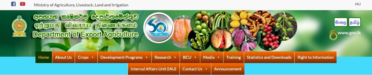
Australia solved this problem: AgDS has a co-brand lockup with the coat of arms, "Australian Government" and the department name, drawn to fixed rules. NSW has rules for co-branded sites too. Sri Lanka needs the same thing, with three languages and a ministry line that can be updated in one place when the cabinet changes.
4. Language names in their own script
This is the one Sri Lankan pattern the design systems agree with. 38% of headers offer languages as සිංහල, தமிழ் and English, each written in its own script, so someone who reads only Tamil can find "தமிழ்" without reading English. GOV.UK does the same with "Cymraeg", Canada with "Français", and USWDS's language selector asks for language names in their own language.
Sri Lanka

Lanka Phosphate: සිංහල and தமிழ் in their own scripts, next to the Gov.lk badge.
GOV.UK and Canada


GOV.UK shows both names; Canada shows only the other language.
5. The utility bar: Gov.lk, A A A and hotlines
A small cluster of headers carries a Gov.lk badge, the language names and A+ A A− text-size buttons, in the same place and the same style. 32 of the 53 sites with the Gov.lk badge also have the text-size buttons, which points to a shared template.
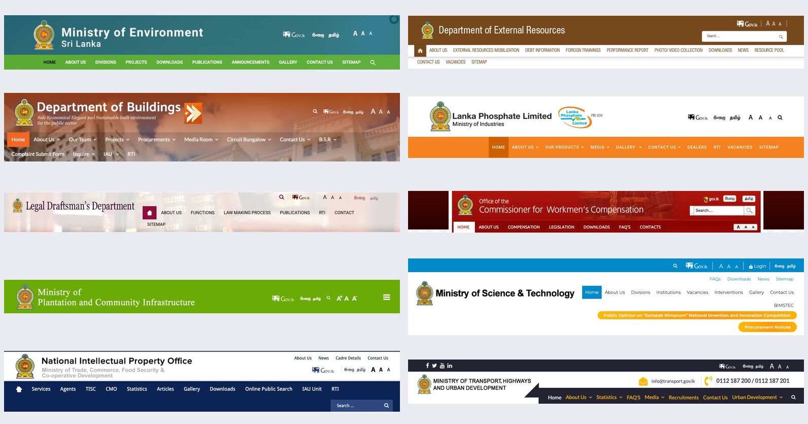
- Gov.lk badge. A link back to the national portal, and a way to say "part of government". It is the nearest thing we have to an official-site line, but only 10% of sites have it and anyone can copy it.
- Text-size buttons. A leftover from early accessibility advice. Browsers' own zoom does the job better and works on every site, so none of the nine design systems offers these buttons.
- Hotlines. Short numbers such as 1919 (the Government Information Centre) or a department's own line. Many citizens call rather than click, so 6% of headers put a number at the top. That is a real need, and no design system covers it.


6. One template, 62 embassies
The Foreign Ministry's missions abroad share one template: emblem, the mission's name in three languages, the national flag, phone, email and a live clock showing local time. 62 of the 69 headers with a flag or a clock are these missions.
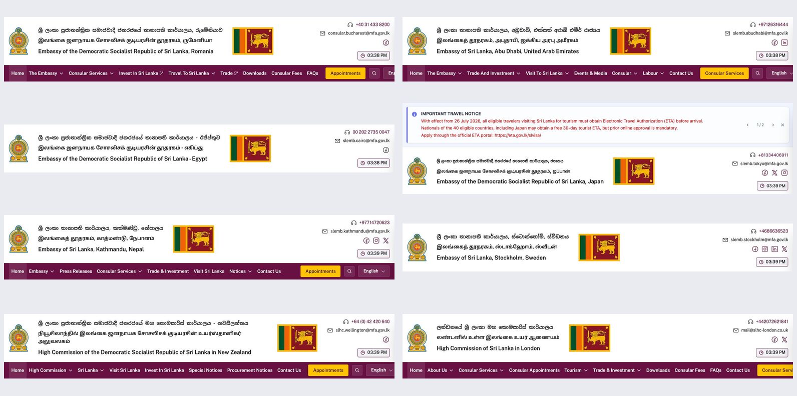
This is what a shared component does: 62 sites look like one service, and one fix would reach all of them. It also shows the risk. The same header takes nearly half of a phone's first screen on every one of them, and where the emblem image failed to load, it failed on all of them at once.
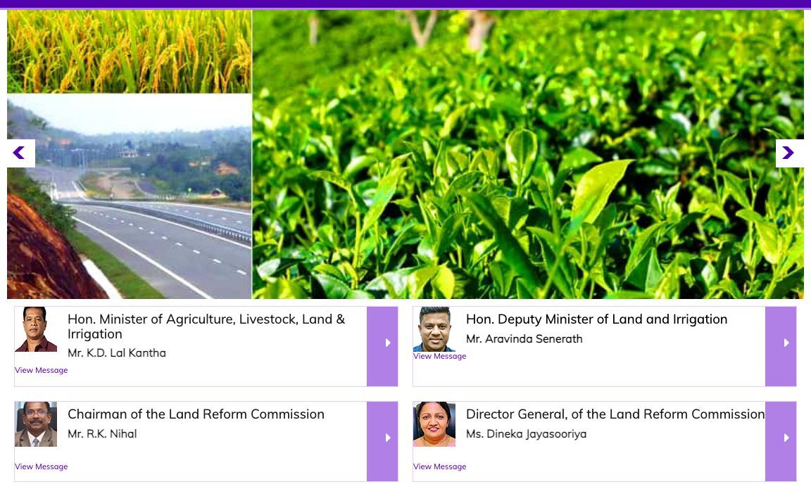
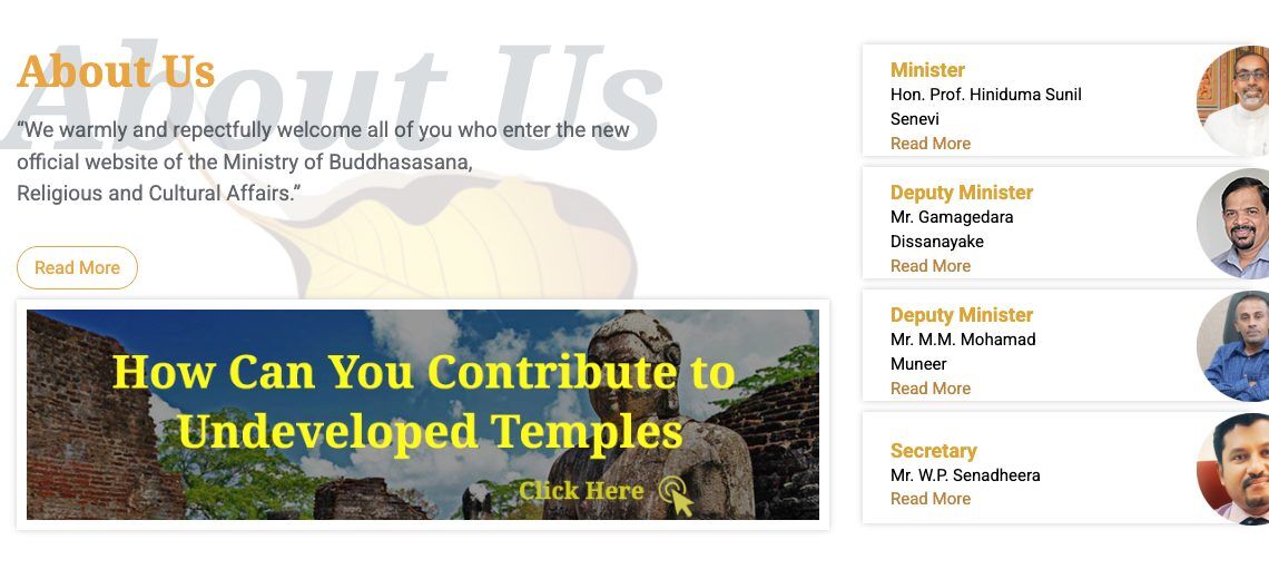
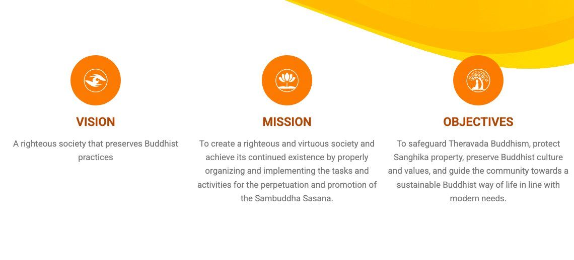
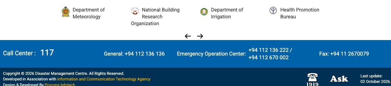
7. Below the header: ministers, vision and related links
The same pattern carries on down the home page. These blocks are common here and rare in other countries' guidance.
What else Sri Lankan home pages carry
Share of 512 home pages whose page code contains each block. Text matching on the downloaded page, so sites built with JavaScript are under-counted. Treat as rough.
- Leadership blocks show who is accountable, and in Sri Lanka political leadership is part of how a ministry presents itself. The cost is that the home page's best space goes to people rather than tasks, and every cabinet change leaves old names and photos behind. GOV.UK puts ministers on the organisation's "who we are" page, not the top of the home page.
- Vision and Mission come from the annual report and corporate plan. They matter to the institution, but citizens rarely come looking for them.
- Related links exist because there is no single government website. Each site points to its siblings because nothing else does. GOV.UK solved that by putting the government on one domain.
- RTI, Tenders, Vacancies, Downloads are there because of rules and demand. The Right to Information Act (No. 12 of 2016) asks public bodies to name information officers and publish proactively, and procurement rules require public notices. These are good candidates for standard page templates.
How the design systems compare
Here is every Sri Lankan pattern above against the nine design systems. A large dot means the system publishes a component for it.
Most Sri Lankan header patterns have no design-system equivalent
Whether each of nine government design systems publishes a component for the pattern, from their component catalogues (October 2026). First column: share of Sri Lankan headers using the pattern.
The biggest gap is a line that four of the nine systems treat as mandatory: an "official website" strip at the very top of every page. The US says "An official website of the United States government", Singapore says "A Singapore Government Agency Website", NSW and Germany have their own. Each comes with a short "how to check" note: official sites use the government domain and HTTPS. Singapore's rule is blunt: "All .gov.sg digital services shall adopt the Official Government Banner at the top of every page."
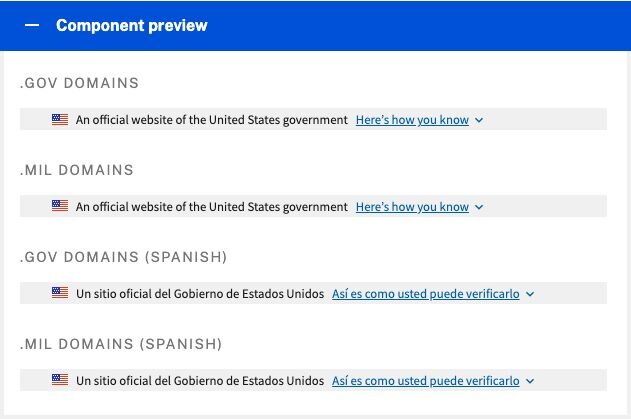
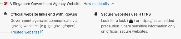
Sri Lanka has nothing shared. The emblem is doing that job, but anyone can copy an emblem. A common line saying "An official website of the Government of Sri Lanka", in Sinhala, Tamil and English, with "official sites end in gov.lk", would be cheap to build and would help with fake sites that copy government pages.
Keep, standardise, replace
Not every pattern deserves to survive. This is how I would sort them for a Sri Lankan government design system.
| Pattern | Verdict | Why |
|---|---|---|
| National emblem | Standardise | A real trust signal. Supply it as one measured file with a minimum size and spacing, like the crown or the coat of arms. |
| Name in three languages | Standardise | Keep it, but as real text with each line marked as Sinhala, Tamil or English. On a phone, show the page's language and drop the other two to a second line or the footer. |
| Parent ministry line | Standardise | Make it part of the lockup, like AgDS, and feed it from one central list so a cabinet change updates every site. |
| Language names in own script | Keep | Already matches GOV.UK, Canada and USWDS. Link to the same page in the other language, not a gate. |
| "Official website" line | Add | Missing today. Four of the nine systems require one. |
| Hotline | Keep | A real need. Give it a standard place, such as a contact link in the header and the number in the footer. |
| Two marks side by side | Fix | Allow the institution's seal next to the national lockup at a fixed size, and stop there. |
| Leadership block | Move | Put it on the "About us" page. Keep the home page for what citizens came to do. |
| Related links strip | Replace | Use one shared "part of the Government of Sri Lanka" footer instead of each site's own logo row. |
| Text-size buttons | Retire | Browser zoom does it better; none of the nine systems offers them. |
| News ticker, visitor counter | Retire | Use a notification banner for urgent news; drop the counter. |
Put together, the keepers make a header that is still clearly Sri Lankan and much lighter. Here is a sketch.
- 1Shared "official website" line, in the page's language
- 2Emblem from one supplied file, fixed size
- 3Name as real text in the page's language, marked with its language
- 4Parent ministry fed from a central list
- 5Language names in their own script, linking to the same page
- 6Menu built around tasks, not the organisation chart
The patterns are not the problem. Building them 512 different ways is.
How I counted
Header elements: five AI vision agents each read seven contact sheets of labelled desktop header screenshots (the Overlook capture of 29 September 2026) and listed what each header showed. 512 of 557 headers were usable. Emblem, trilingual name, flag, clock and language names are reliable. On the language switcher, the result (37.5%) matches Overlook's separate code-based audit (36.8%). "Own seal" and "two marks" are noisier. Content blocks: a text scan of 512 home pages downloaded on 7 October 2026. Design systems: each system's own component catalogue and guidance as published in October 2026. You can look at every header yourself in Overlook.
Questions people ask
What makes a Sri Lankan government website header different?
Most combine the national emblem, the institution's name in Sinhala, Tamil and English, and often the parent ministry's name. In a visual read of 512 headers, 54% showed the emblem, 37% a trilingual name and 13% a parent-ministry line.
Do government design systems like GOV.UK have these components?
Partly. Four of nine systems (USWDS, NSW, Singapore, KERN) have an 'official website' strip, Australia's AgDS and NSW have a government-plus-agency lockup, and five have a language switcher. None has a component for a name in three languages, a parent-ministry line, text-size buttons, a hotline in the header or a leadership block.
Why do Sri Lankan government sites show the name in three languages?
Sinhala and Tamil are official languages and English is the link language under the Constitution, and government letterheads and name boards are normally trilingual. The website header copies the letterhead.
What should a Sri Lankan government design system do with these patterns?
Keep and standardise the identity block (emblem, name, parent ministry) as one measured lockup set in real text, add a shared 'official website of the Government of Sri Lanka' line, keep language names in their own script, and replace text-size buttons, news tickers and visitor counters with standard components.
Published . Header counts from 512 usable header captures (29 September 2026), read visually; content-block counts from a text scan of 512 home pages (7 October 2026). Read as Markdown.